Project details
Budget:
$700
Client:
Habitual
Tool:
Figma
E-commerce App
Designed to cater to users who frequently shop online by streamlining the browsing, purchasing, and post-purchase experience. The app focuses on building engaging shopping habits through personalized recommendations, reward systems, and a seamless user interface. The redesign aimed to improve user satisfaction, loyalty, and efficiency.
Initial Discovery and Documenting
During the Discovery phase of the Double Diamond process, we immersed ourselves in understanding frequent online shoppers’ behaviors and pain points through surveys, interviews, and competitor analysis of apps like Amazon and Flipkart. This helped reveal issues like cluttered navigation, overwhelming information, and lack of engaging features.
In the Documenting phase, we synthesized these insights into clear user needs and pain points: quick and easy navigation, personalized recommendations, simple repeat purchasing, and effective rewards tracking. This documentation provided a focused foundation to guide the design process, ensuring every decision directly addressed user challenges and expectations.
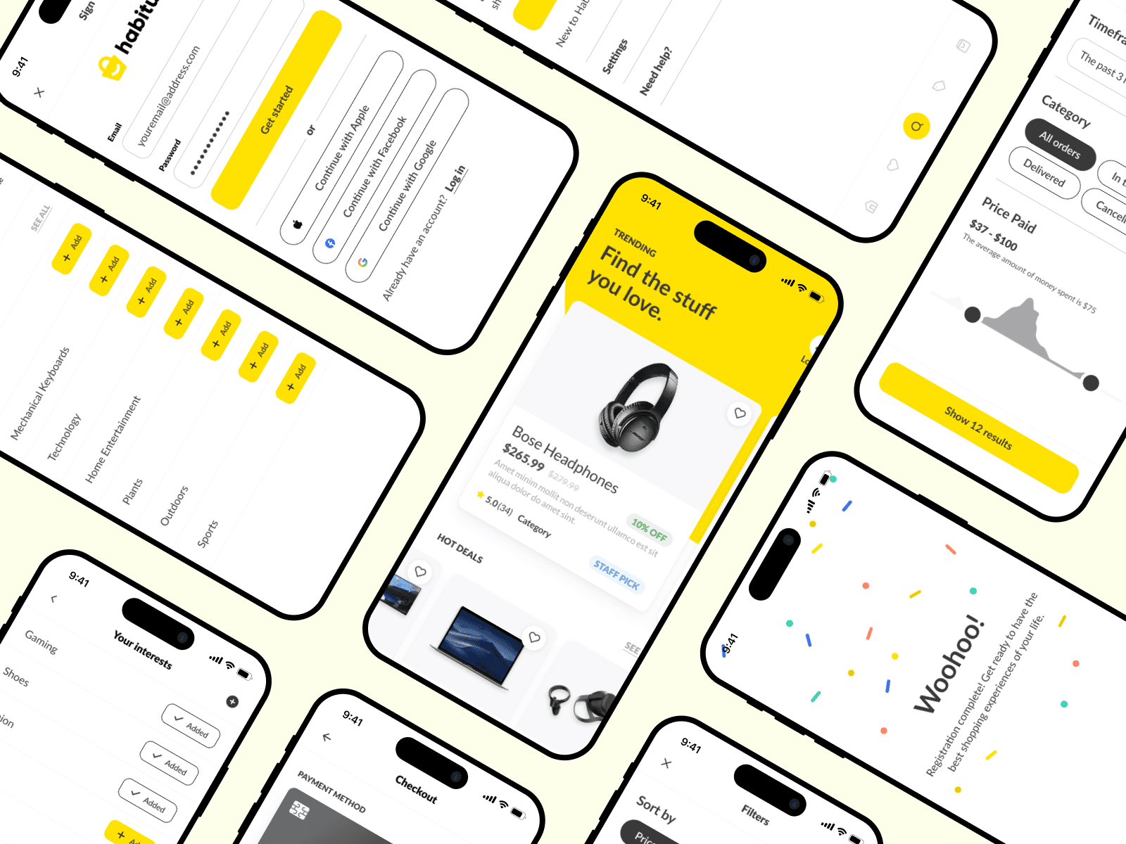
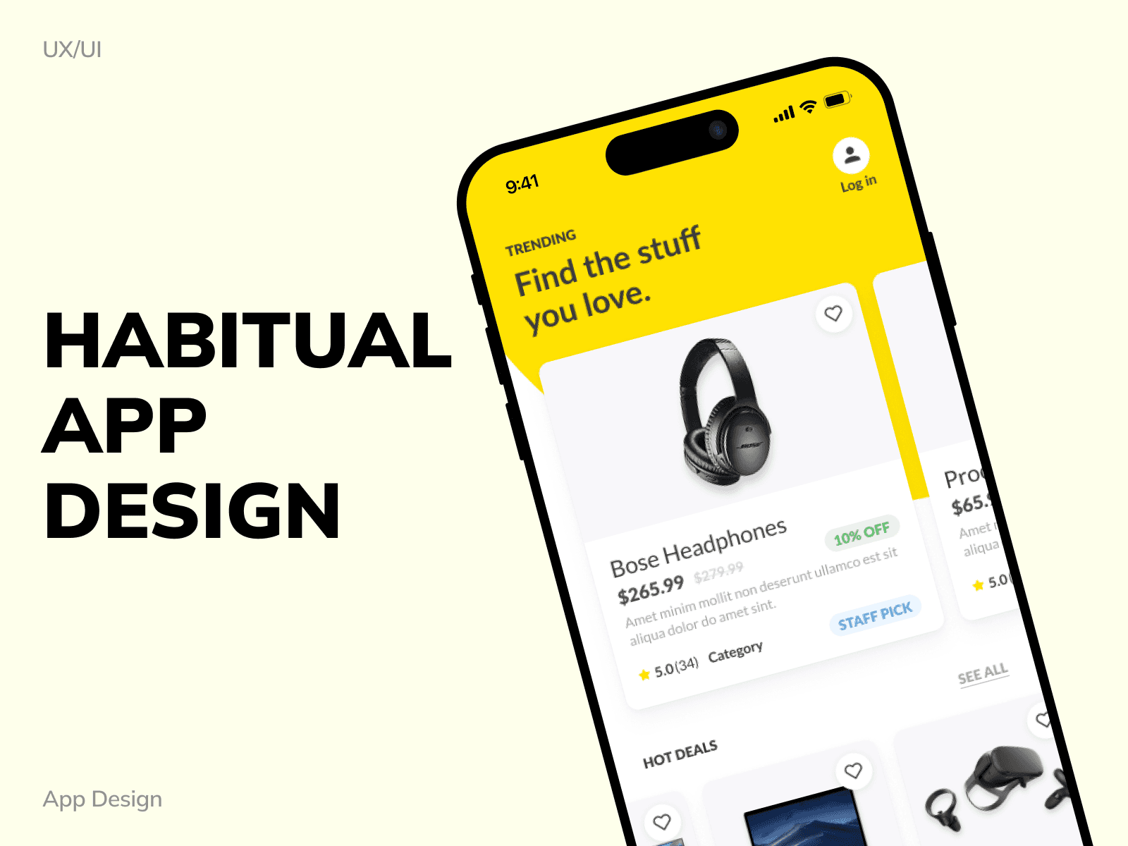
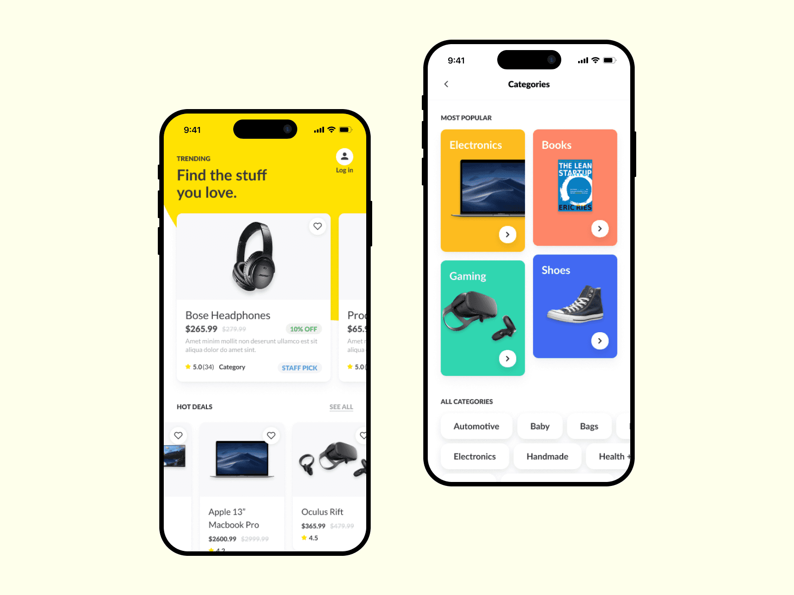
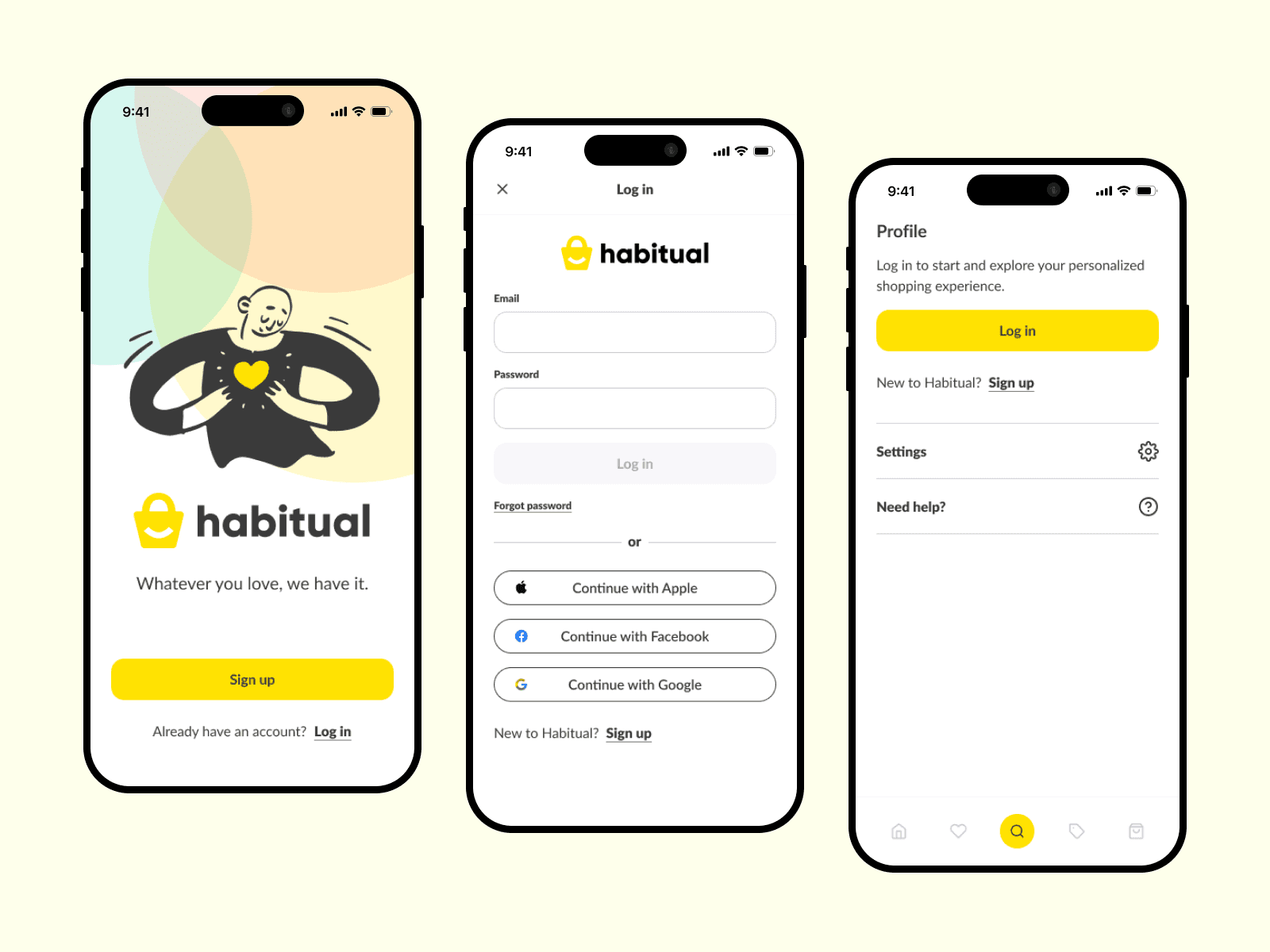
Designing and Delivery
In the Designing phase, we translated research insights into tangible solutions by creating low-fidelity sketches and wireframes that prioritized simplified navigation, personalized home screens, and a rewards dashboard. These early concepts focused on reducing clutter, enhancing user flow, and integrating gamification to encourage habitual use. Mid-fidelity prototypes were then developed using Figma, emphasizing key interactions like personalized recommendations, clear order tracking, and a streamlined bottom navigation bar for easy access to core features.
The Delivering phase involved user testing and iterative refinements to validate the design’s effectiveness. Feedback highlighted increased user satisfaction, particularly around the rewards system and personalized content, which fostered regular engagement. The final design balanced aesthetics with functionality, providing a seamless, intuitive experience that addressed initial pain points and supported habitual shopping behaviors.
Conclusion
A great UI/UX isn’t just nice to have—it’s the secret sauce for any successful app or website. When you put users first, understand their quirks, and design around their needs, you create an experience so smooth, they’ll wonder how they ever lived without it. Just remember: design isn’t a “set it and forget it” deal.